Nickelodeon
Responsive Website
Background
Nick.com is a website owned and developed by Nickelodeon, launched in October 1995. The website serves mainly as an online portal for Nickelodeon content, and offers online games, video streaming, radio streaming and individual websites for each show it broadcasts. Nick.com has received positive critical reaction, receiving various awards. Positive praise has also been received because of the steps taken by the website to protect user privacy.
Role: UX/UI
Challenge:
1. Build a website to better ‘sell’ our audience on using our web platform improve usability and increase accessibility.
2. Design several new ways that users could discover more content watch their favorite videos and play their favorites games.
3. Utilized a multitude of tools including UX research, user story mapping, sketches, browser documentation, wireframe prototypes and polished comps to tell this user story.
Project Rundown:
I am a huge fan of nickelodeon and the ask was to design something different from the competition. I love designing for new interfaces, and I think the challenge of designing for kids interface is fascinating so I decided to tackle what I think the nickelodeon website should look like. I designed a concept emphasized guided content discovery over user motivated navigation, as a way to introduce kids to new characters and content. The design prioritized landscape orientation to take advantage of bigger screens with wider aspect ratios. This was an effort to create an immersive full screen video watching and game playing experience.
About the Interface:
Product owners and UX sat down and inventoried the content of our existing site. What should we keep, remove or add? We realized that the existing site was not enough flexible to meet our business and user needs. We needed to expose the breadth of our available content, be able to feature important content, encourage exploration of our different properties and content types, to help kids find exactly what they are looking for, be able to easily refresh content without a lot of operational effort and to serve ads.

Process
Empathize
Conducting Research to develop an Understanding of the Users through a Variety of Methods
I got most the insight through kids interviews collaborate with research team. Luckily we had a lot of research data from interviews and research findings and they are always more than willing to give their opinions.
I created a quick Empathy Map based on this information so that nickelodeon could better understand their users in the future. All this information combined was starting to help me understand the bigger picture behind the problem.

ETHAN - 6 Years old
The Loyal Gamer
“I Love SuperBrawl!!”

LOGAN - 9 Years old
The fast and Furious
“I Like to have fun”
Define
Combining the Research and Observations to Define a User Problem
After looking through the research it became clear that The website was behind compare the competition and was low engagement with the audience especially for this project were a lot of stakeholders with different business needs which very often were conflicted with each other. At the same time from our user feedback show that we need to make more usable and accessible experience.
Problem Statement: We have observed that the existing nick website doesn’t inspire kids to visit our site and is causing confusion around expectations.
Ideate
Sketching Stage
I went through a lot of sketching on paper for wireframes and user flows before I did anything on a computer.
User story Mapping Stage
In collaboration with the product team I created user story maps to better define the product.


Wireframe Stage
I used tools such as Axure and Sketch to assemble the wireframes into a clickable prototype, which became the primary way we communicated about the project. I ended up wiring up different options for user flows. I gave every wireframe its own artboard so that I could quickly export all of them and import them into prototyping software.
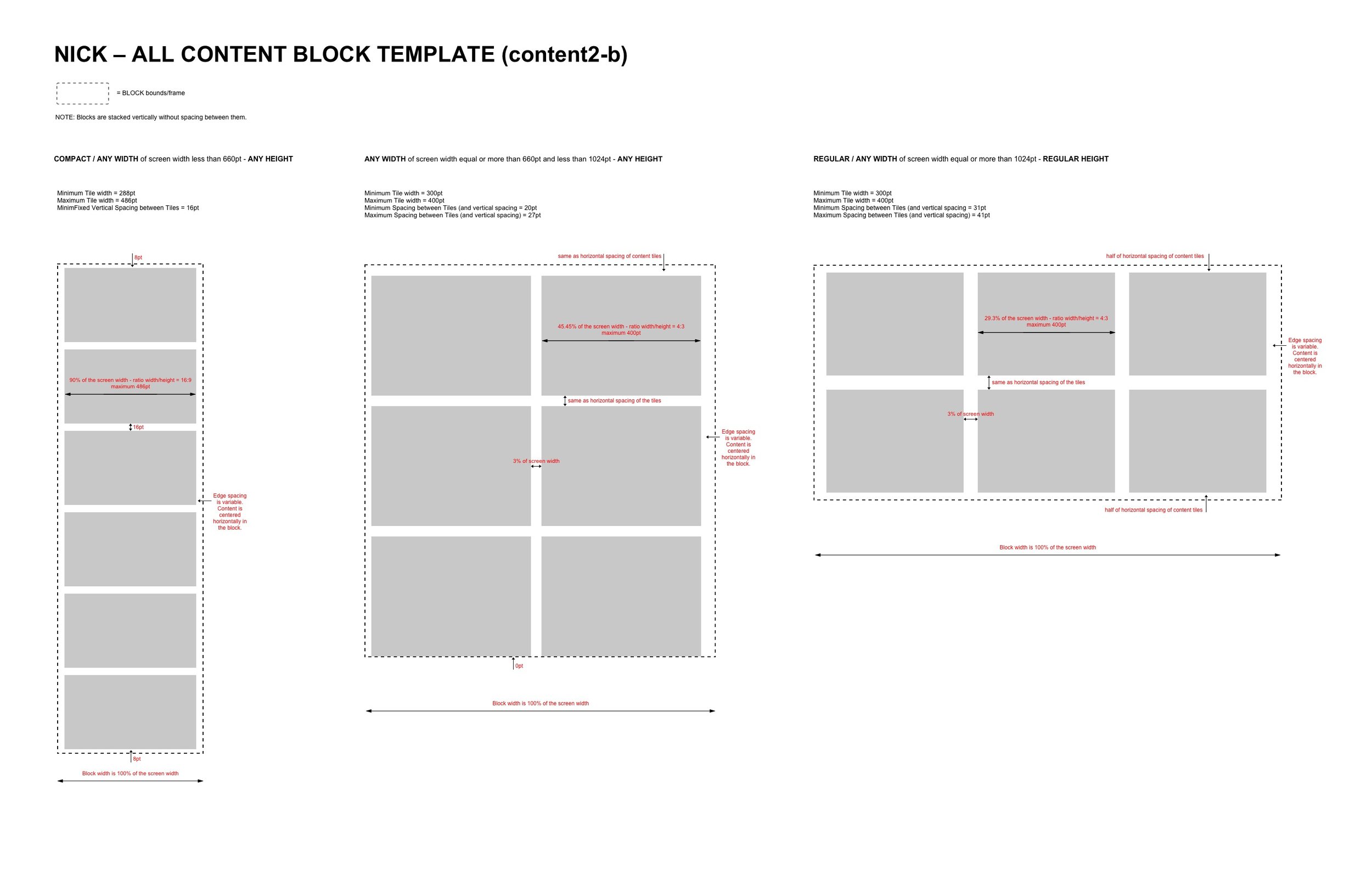
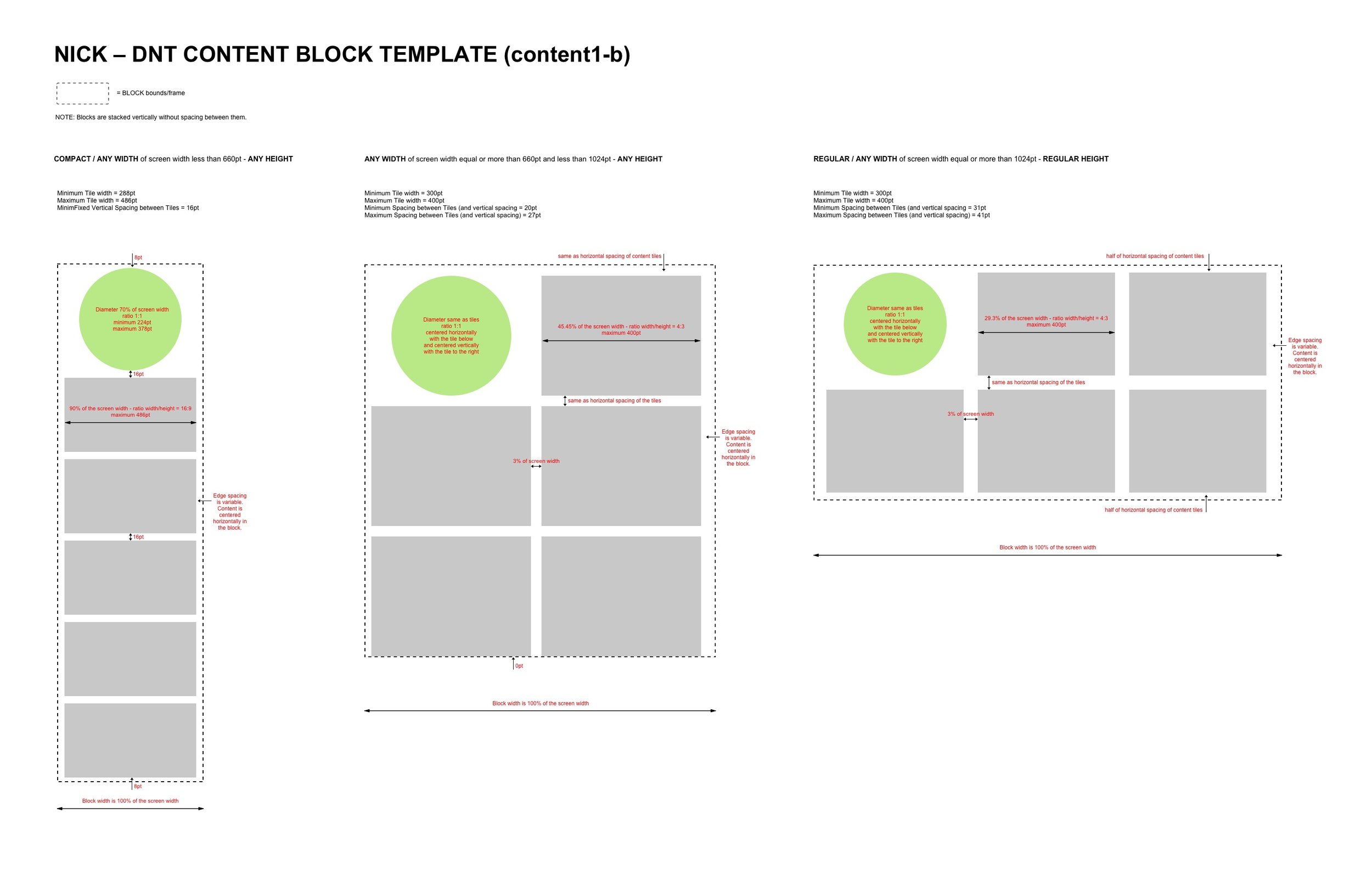
Nick.com content stream block structure. Any new feature only requires the creation of a new block type that is easily inserted into the stream.

Content block 6: reverse chronological content block of 6 promos

Feature block 4: this configuration shows 4 promos

Content block DNT 6: reverse chronological content block that contains a TNT button

Content block Poll 3: reverse chronological content block that contains a Poll
Prototyping Stage
I took all the low-fidelity screens from my wires and put them in Invision. I had several coworkers to play around with the prototype and they gave me some value feedback.
Test
Testing with real users to get feedback
We tested the approach through a mix of user ages and got invaluable feedback. In the end I decide to go with approach that blended the best parts of the two prototypes.
Implement
Making the vision real
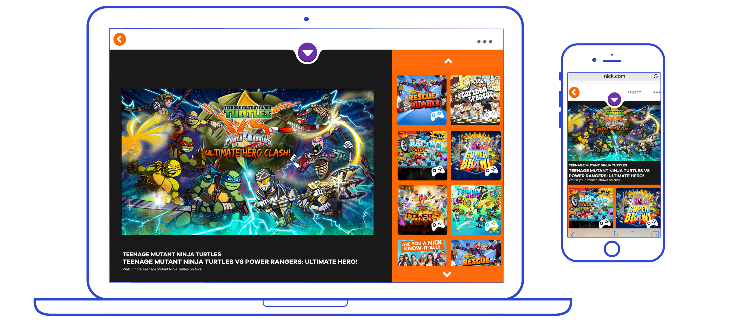
Here is some of the designs that went into making the project.

Nick Web Mobile - Spongebob Property

Nick Web Mobile - Home
Conclusions
Overall, kids had a clear preference for the new execution of Nick.com versus the current one, regardless of their familiarity with the website
They believed the new website offers them more rapid access to the content they would want
This is due to the fixed character nav bar that spotlights their favorite properties and the wide variety of content and categories immediately available from the homepage
In line with this, the new version of the site feels more organized with random mixture of content on the new homepage

Design System
Creation of a ‘Design System’ Specification
To ensure that our UI elements were well-defined and looked and acted the same way everywhere, I took a systematic approach to outlining our design system. Always thinking responsively, I outlined the look & feel and behavior of elements like forms, buttons, navigation items, and other responsive modules that were more specific to our web app.
Here is a sample:


The site is hot stuff, and we are all very proud! It does a much better job at describing and selling our platform, and it looks visually cleaner and much more vibrant. www.nick.com


