Pip's Island
Responsive Website
Background
Pip’s Island is a pioneer in the children’s multi channel media sector, striving to disrupt the static industry and become the leader in children’s immersive entertainment. Pip’s Island is building the first children’s company to seamlessly deploy a comprehensive, original narrative over digital, broadcast, and live events from its inception.
Role: UX, UI, Interaction Design
Challenge:
1. Create a responsive "mobile-first," website to support the operations of their interactive brand.
2. Create an e-commerce to sell Pip's Island merchandise. Have a clean UI, simplified user experience to fulfill the customer's purchasing needs as quickly and effortlessly as possible.
3. Support live show ticket booking that the user should be able to move through the sequence of actions to book a ticket quickly.

Project Rundown:
The mobile first approach is one of the best strategies to create either a responsive or adaptive design.
I started off with some comparative research. I played around with various Broadway shows sites and tried to book tickets with them. I wanted to create a simple and easy way to purchase tickets at Pip’s.
Right now the flow of booking on Pip’s island for a live show in New York is: Book Ticket page - Ticket selection - Month Selection - Date selection - Hour selection - Checkout, Payment - Booking confirmation.
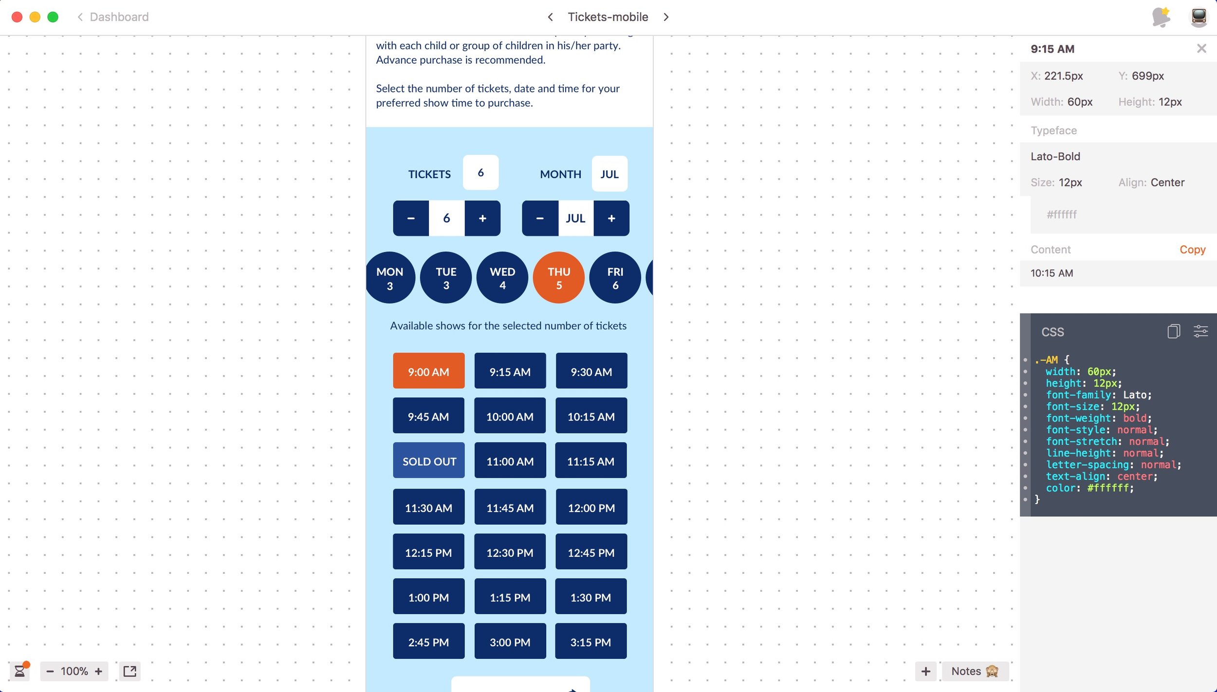
This flow can lead to the following problem: For the selected date, only 5 tickets are available for that time, and the user is looking to book 6. I decided to have a sold out label and a call label. A warning after 15 min was also created to remind the user that due to inactivity your session is about to expire.
We also had to deliver this on a tight deadline in order to accommodate an event three months away.

Also, based on trends of well known apps like Airbnb and Typeform, will compose simple screens with only one clear task per screen on this flow, so the user feels the process simpler and faster. The idea is to make it look simple to the eye, but be complex inside. I believe that a good user experience is not made by reducing number of screens, but reduce the number of operations instead.
I used my favorite app The ShipStation app for Shopify and we make a costume design experience for the e-commerce. I designed couple other various pages on the site and my approach is to show better values and mission of Pip's Island. I had took all of planning pages out.
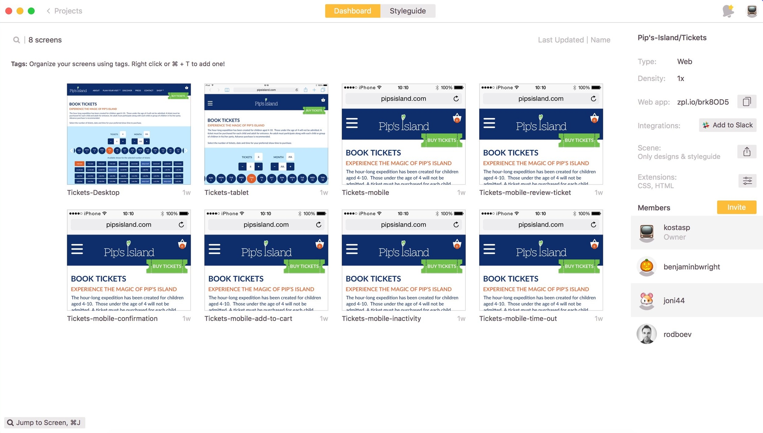
I started with wireframes in which I tested multiple UX flows. We moved from there to a working prototype that satisfied all of the requirements. Once we had it working properly, I finished up the process by designing high fidelity comps in Sketch and sharing them with my dev team using Zeplin, a tool that allows developers to preview fonts, icons, hex codes from a Sketch file using a very simple interface.
From Wireframes
To High Fidelity Designs
To Pixel - Perfect Dev HandOff


